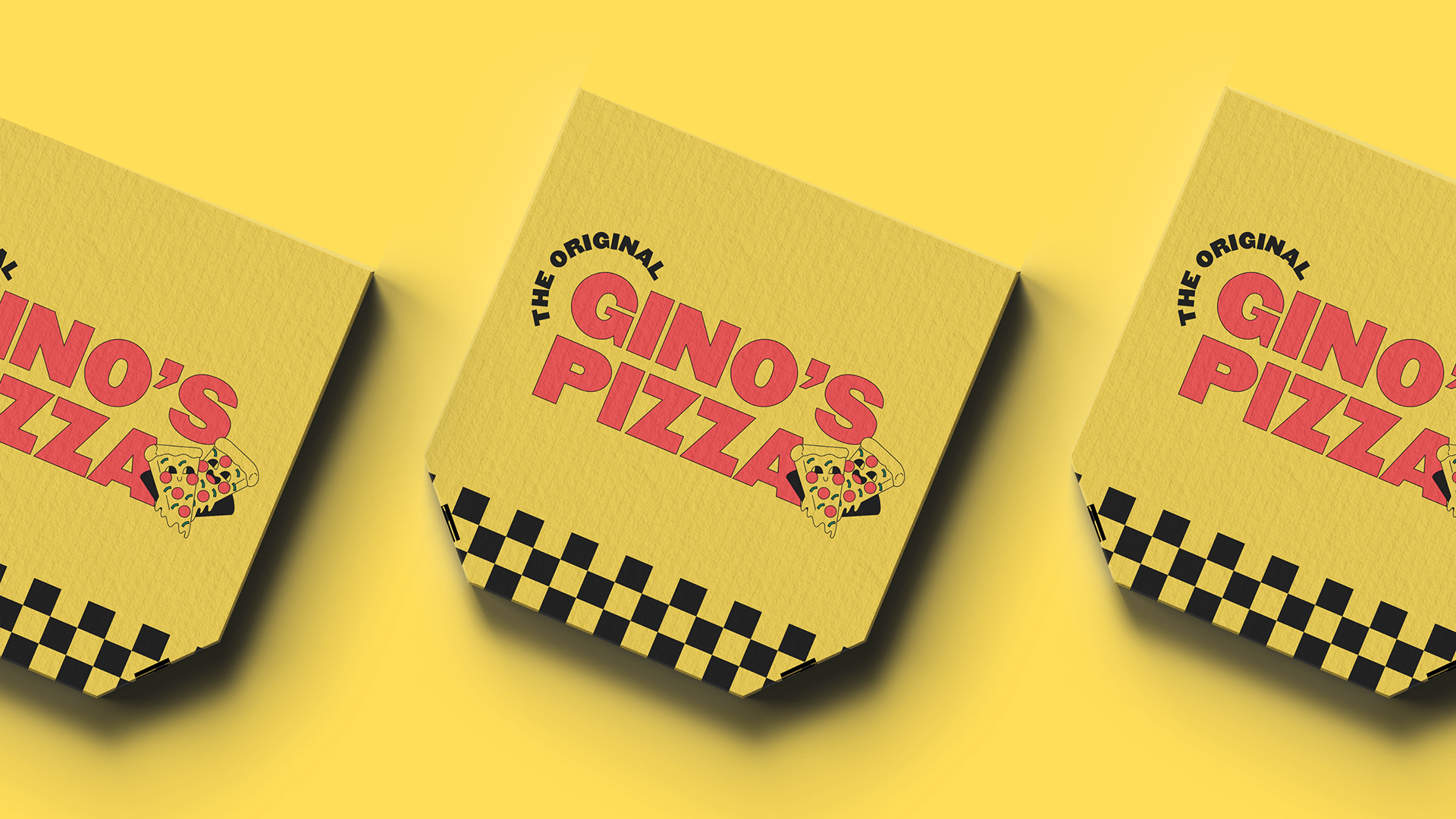
Gino’s Pizza
We Are The Original.
Gino's Pizza is a local chain that has been serving delicious pies since 1989. The brand wants to attract a hipster audience by creating a modern, bold, and edgy brand design that reflects the quality and authenticity of the company. The goal is to appeal to the younger and trendier demographic while maintaining the brand's heritage.
The logo for Gino's Pizza embodies a perfect fusion of tradition and modernity. With its bold font logotype exuding confidence and timelessness, coupled with a trendy mascot featuring a cheerful pizza slice, it captures the essence of deliciousness and joy. The vibrant color scheme of black, yellow, and red further enhances its appeal, making it an iconic symbol that resonates with both classic pizza lovers and contemporary food enthusiasts alike.
Services:
Brand Identity, Packaging
Industry:
Food, Hospitality
The Good:
The restaurant offers a nostalgic pizza experience, making each visit memorable and enjoyable.


